Coach Ryan Kohler reviews season-to-season changes in heart rate/power distributions to illustrate improvements across the different energy systems.
Video Transcript
Intro 00:16
Welcome to Fast Talk Laboratories, your source for the science of cycling performance.
Ryan Kohler 00:25
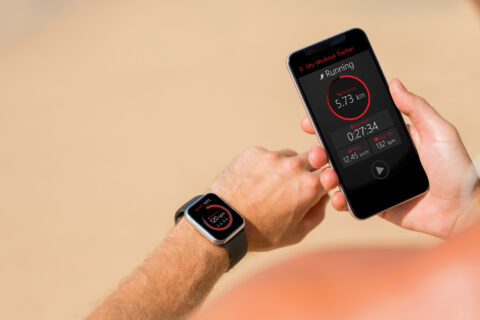
All right, welcome back to another screen share, flying solo today without Trevor. So, this one is going to be, you know, really looking at the comparisons and looking for that progress. So, I’m using intervals.icu, again, because I really like this one graph that’s on here.
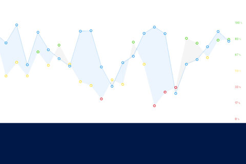
Chart Looking at Power vs. Heart Rate
Ryan Kohler 00:48
Okay, so what we have here is this chart looking at power versus heart rate, and I really like this because it’s a pretty simple chart, but it gives you a lot of great information. So, on the bottom, what we’ll see on this x-axis is power, we can see here down 95 watts, and the power just increases as we go to the right. And then on the y-axis, we have percentage of threshold heart rate. So low intensities are 75-80%, all the way up to 100-105%, right? So, intensity increasing up here, and then intensity increasing on the x-axis, out to the right. So, what this is really showing is just this relationship of power and heart rate, right? So, we know we’ve talked a lot about cardiovascular drift in the past, and looking at, you know, getting the adaptations to help improve our endurance and our performance.
As We Go to These Higher Powers, What Is the Relationship to Heart Rate?
Ryan Kohler 01:41
So, this is a really neat graph where we see that as we go to these higher powers, what is the relationship to heart rate? So, as we improve, what we should see is that essentially, whichever line we’re looking at, is going to slide out to the right. So that would mean at, for example, 80%, of threshold heart rate, we’re no longer producing, and in this graph, we’re looking at 135 watts, but now we’re actually producing more, 146 watts. So, as we can slide that graph out to the right, that shows an improved power for a given heart rate, which of course then would translate to improve performance. So, what we’re seeing here, and I’ll just use this as an example, right around this 77-point is, we see that the blue line is showing January of 2020, and the red line is showing January of 2021. So just comparing the same timeframes across two different seasons. And what we see here is very easily that oh, this, this graph is actually sliding to the right a bit, and we’re seeing at 77%, we have 135 watts from last year, and now we’re at 143 watts this year. So, there’s that eight-watt increase in power for the same given heart rate. So, if we look quickly at this, then we say, all right, well, January, this is the time of year when we’re doing some base work, we’re gonna be working, primarily lower powers, and what are the responses that we get from this? So overall, starting down here, at very low intensities, we can see that this red line is generally below and to the right, of the blue line. And that’s taking us all the way up until about 85% of threshold, which is good, because the whole goal right now for me, and this is this is my chart, the whole goal is to say, well, I want to do a lot of bass work, and I want to see those, those bass power outputs start to improve at the same heart rate.
Ryan Kohler 03:46
So, all the things we talked about training, to, you know, allow some cardiac drift and ride a little bit beyond that training, you know, below VT1 primarily, and not going too hard, too early in the season is actually paying off because we’re seeing improvements here. As we start to go up to some of the higher intensities, and you know, 100% of threshold, we see yeah, there’s some changes, we were actually in better shape around threshold last year, but this is the interesting thing, If we look at well, it’s it’s you know, the really the scenario last year, at this time, I was still doing more threshold, I was coaching more indoor cycling classes, we had a lot more of the intensity built in there, so that was a little bit hard to get away from, you know, and we see that, you know, around threshold yeah, was doing better last year, but we also heard Trevor say this many times, if you’re putting out your best efforts in January, that’s not a good indicator for a successful season coming up. So So yeah, this I’m okay with you know, but when I look at this and want to take away the big picture and say well good, how does this look overall? We’re focused on base work, we want to do a lot of aerobic, good, this is supporting that, everything else not to worry about right now.
Identifying Distributions in Heart Rate Zones
Ryan Kohler 05:02
So, then what we can do is take that back and use some of the other charts in here, and this is from January 2020. And this gives a really nice breakdown of your time in power and heart rate zones, and time and heart rate zones over here. And what it does is it quickly identifies sort of what your distribution looks like. So we can see here we have the popular polarized view, where it’s skewed very heavily to zones one and two, and we have a smaller amount here in zone five, very, very little almost non-existent time in zones three and four, this pyramid will break down, you can see the percentages here given, but it’s basically a lot of base work, but a decent amount of threshold and just a little bit of zone five or higher, we can see here a threshold style, of course, that threshold number is going to predominate, we have a high intensity approach with a little bit of bass, not too much, a little bit of threshold, but mostly high intensity, this just looks like it hurts. We have a bass approach, primarily zones one and two, we have very little time at threshold, and even less time at zone five and above. So, as we change our training, these distributions will update in real time, and this will essentially slide over back and forth to highlight what your distribution looks like. So when I look back on January 2020, I say, “Oh, yeah, pyramidal,” okay, well, there was a good amount of time spent at that tempo thresholds sweet spot, we can see here sweet spot was relatively high, so that would support this area, because we’re working in this, you know, 90 all the way up to roughly 98%, that’s a lot of time at threshold, and this is one of those areas that we can see it reflected.
Using Data To Stay On Track With Base Focus
Ryan Kohler 06:51
Now if we shift gears and go to January of this year, very, very different. And I’ll just do a quick comparison, we have the pyramidal here that’s highlighted, we switch to 2021. Now we have the base highlighted, so this was much easier to achieve this with some focus base work and being very, very adamant about pulling out the threshold. So, we’ve slid over here, we see almost 90% of time spent in that base zone, compared to last year at you know 72%. So, if we go over here, we see what 51 minutes and sweet spot, and last year, we had four hours in sweet spot. So, we see very quickly, you know how those changes can impact our progress, you know, and we have to think about this as we go through, you know, block-to-block, month, however we measure that, you know, are we achieving these metrics and these goals from month to month? And are those ultimately leading us toward our long-term goals of a race and event or just our progress throughout the season? So, I really like this as a quick way to look and see okay, are we achieving this? So, every time a ride gets uploaded in here, this will adjust in real time, and I can quickly see all right, am I staying on track with this base focus? Great, let’s just keep running with that. Alright, so we’ve seen a lot of data here, and we can see comparisons from previous seasons to the season, and really just easily view what our distribution looks like, right? With each distribution, we’re going to have a certain adaptation that we’re looking for, so as you’re planning out your seasons, this is one tool that can be used to very quickly monitor your progress in real time, and even look at the big picture view. So hopefully this helps with your training and your metrics, and head on over to the forums at fasttalklabs.com for more.