We highlight the most powerful features of each of the three most popular training analysis tools.
Video Transcript
Introduction to Basic Data Used in Cycling
Trevor Connor 00:00
Today, we’re going to take a look at three of the most popular training software packages on the market.
Ryan Kohler 00:05
Each package will have its own pros and cons, and remember that while this is a basic video, the concepts apply to everyone.
Trevor Connor 00:11
So, let’s get started by taking a look at TrainingPeaks.
Intro 00:23
Welcome to Fast Talk Laboratories, your source for the science of endurance performance.
TrainingPeaks
Trevor Connor 00:37
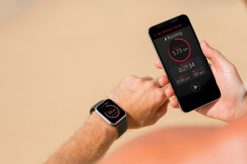
We’ll start today with TrainingPeaks. This is the most popular software out there for endurance athletes, a lot of you have probably used this, we’re actually going to use this to explain some of the concepts that will then compare the other software to. This is your opening screen on TrainingPeaks, because this is just a cursory overview, we’re going to skip over this and go right to the calendar. So, we are looking at my data here, I’m hoping that I can show you some of the tips and tricks that I’ve figured out over the years, that have really helped me to monitor my training.
Goal Setting Feature
Trevor Connor 01:06
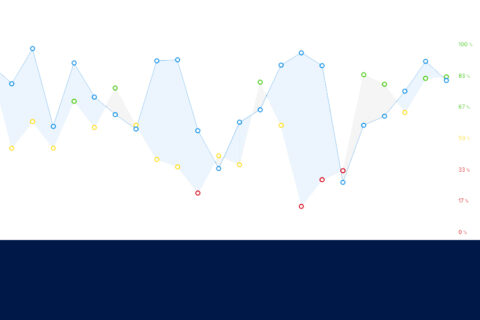
So, the first thing I’m going to point out is here are all my ride files, this is what I did on the bike, notice there in green, and yellow. That’s actually an indicator of how well you accomplish your goals for that ride. So, you can set goals such as duration, or TSS, or distance, that’s going to say, yep, you accomplish it, or no, you didn’t quite, red is if you didn’t accomplish it at all like you didn’t do the workout.
Summaries of the Week
Trevor Connor 01:30
Now, the nice thing over here, it gives you summaries of the week. So, here you can see estimates of your overall fitness, form, and fatigue, we’ll talk about that in a minute. It’ll show you a duration, total training stress score, in the gray, it shows you what your goals were for the week, and then here’s what you actually accomplished, overall, for the week. So, it’s adding up the goals for each ride and then giving you the actual totals for each ride.
Metrics
Trevor Connor 01:54
Another thing I really like about TrainingPeaks is there are other things that you can track. So, let’s click on this here. This is your metrics, and there’s a whole bunch of metrics that you can track, you can pick which ones you want, these are the ones I like. So, I keep all this information about how my sleep was including my hours, the quality of the sleep, you can track things like how fatigued you were, how motivated you were, how many steps you did in the day, a whole lot of different things that you can track, I have most of my athletes track this, I track it myself and actually find it really useful, to get that assessment of the day, I do it at the end of every single day.
Trevor Connor 02:33
Another thing that I really like to use in TrainingPeaks, and I took a couple of their added features to make this work, I like to set a goal for the week. So, if we click on this, I give this all my athletes and to myself, I set a recovery goal for the week on a scale of one to five, three being kind of a typical week, five being fully recovered, one as you can barely walk, I set a volume goal, and then I give a description of what I want the week to be about, then to the end of the week, I have my athletes put in their actuals. So, you can see here, I wanted to be a little bit recovered this week and came out below a three, so that wasn’t a great week, and my volume was low. So, I look at that and go, I didn’t put in that much volume, I came out pretty tired, something’s off track, and that’s exactly what’s going on right now. I’m a little cooked, and I need to change my training, this will help you see that.
Field Notes
Trevor Connor 03:24
So, let’s cancel out. Another thing I like to do click on this, there’s a notes field in TrainingPeaks. So, I like every week to then give a description of how the week went, some notes for myself, or I have my athletes do the same, so they can give me their assessment of the week. So, these are just some of the nice things we can do in TrainingPeaks.
Analyzing Race Data
Trevor Connor 03:46
Let’s take a look at an actual ride file. So, here’s my Sunday ride. Let’s click on that. Here’s the basic data that you have, so again, you can see there’s planned and completed, so this is why it’s yellow, I planned five hours only completed three, I wanted to have a kind of be a big hard day and wasn’t quite there. So, this is your TSS score, we’ve talked about that a lot, it stands for training stress score. It’s an estimate of basically how stressful this ride was on your body, though bear in mind, TSS says nothing about the type of ride, a really hard, short interval session can produce the same training stress as a long, easy ride, but obviously they have a very different impact on your body. So, be careful about just judging your rides on TSS. Another nice thing that it allows you to do is, how did you feel for the day? How hard was the ride? If we scroll down a little bit, again, I’m a big fan of descriptions if you talk to any coach, Ryan said this many times, we love our athletes to give descriptions. So, it’s good to go in there and say, how did the ride feel? If you didn’t really accomplish what you wanted to accomplish, why? Get those things in there so you can look back at those descriptions.
Trevor Connor 04:58
So, let’s expand this. They have a larger view, and this is where you get into a lot of the fun stuff. So, here’s a map of the ride, which is kind of nice, and you can zoom in on any part of that. Down here is what I really liked to look at in these ride files, which is all the data mapped out for the ride. So, for example, you can see where you’re at this gray here is the profile of the course, here’s a big climb I did towards the end of the ride, the red is your heart rate, pink is your power, yellow is your cadence, and green is your speed. Now, you can see it can sometimes be a little confusing to see this data, there are some ways you can change it so you can see it differently. So, one is to go over here, and we can change the smoothing. So, you might want to make it more smooth. Here, you can see that really smooth it out, or we can go all the way over, and now you can see every little bit of it, and it’s actually harder to see. Now, the reason you’d want to take all the smoothing off is if you did short intervals, say like a 20-second interval, you actually want to see every little variation in that power and heart rate, you don’t want it to be smooth at all to really see how you did those intervals, but that’s where you would zoom in, and let’s show that. So, we can select a part of the workout. So, here’s the climb I did. Let’s select that. Now, a couple of things you’ll notice once this is selected is A, you’ll see the selection over here all the data over here is now changed to just reflect that segment, that climb, so you can see my average power for just that climb, average heart rate for does that climb, can see it was a 31-minute climb. We could also zoom in on the graph to see it in a little more detail. So, here, you can really get that assessment of the climb. In this case, you can see I was pretty steady. So, power heart rate is all kind of a flatline, at least that’s the closest thing you’ll see to flatline and power.
Trevor Connor 07:00
Let’s get out of here. Let me show you what other nice features that they have with rides in TrainingPeaks. Let’s open up this workout right here, this is a sprint workout I did, I was able to design this workout before I actually did it. So, that’s what you’re seeing up here, and if we click on that, you see a bigger view of this workout. So, I could go in here, you can see here are different types of blocks that you can drop in, you can put those in there, build the workout, you can do it by power, you can do it by heart rate, you can do it by the rate of perceived exertion, and down here, it shows you all the details of that particular workout. Once you’ve built it, and you really like it, you can go to export, let’s click on that, and then you can drop it out as a fit file, or ZedWO file. So, this is for Zwift, this is for a bike computer, and then you can actually run the workout right off your bike computer or in Zwift.
Trevor Connor 07:56
So, let’s get out of this, and get out of this. Okay, so that’s workout views, there is one other view that we want to show you in TrainingPeaks, let’s go up to the dashboard. This is a longer-term view of what’s going on with your training, so you can see your general trends, there’s a lot of graphs that you can put in here, we’re just going to really focus on a couple here.
Performance Management Chart
Trevor Connor 08:22
One is the PMC, which is that, so let’s expand this and I’ll explain this concept to you. So, PMC stands for performance management chart, almost all software now has a version of this. The whole concept has been around for many decades now. The line that most people are really going to focus on is this gray line here, this is called your CTL, chronic training load, or what people like to call it is your fitness level. So, it shows basically how fit you are, but I’m going to say be very careful about that because a lot of people get into, how high can I push my CTL? Because the higher it is, the thinner rider I am. There’s some truth to that, but certainly, if you’re looking at a world tour athlete who is going to the Tour de France, they’ve got to be up 140-160 CTL If they’re gonna be able to perform, or if you have more of an amateur, like most of us, you’re gonna see something in that kind of 60 to 100 range. It is more complex than that, so Ryan, do you want to explain these other graphs that we’re looking at and how they all interplay with one another?
Ryan Kohler 09:29
So yeah, we have that blue line that shows our overall training load, chronic training load, if we look at the other colors on there, we have pink and yellow. So, that pink line is our acute training load. So, let’s take a peek at maybe that one in the middle of the screen with the big peak in it. Yeah, we can see. So, that’s going to show a pretty high training load, that’s also called your fatigue. So, if we start to get this balance of fitness in blue, and then fatigue in pink, so when these go together, what we ended up with is a form, and a readiness basically, and that’s that yellow line. So, you can see with that high pink line where there’s a lot of acute fatigue, then in Trevor’s case here, he was pretty cooked, and he wasn’t on good form. So, this would not be the time for him to expect a good performance, we see that he has that really high training load, really high CTL, but because of the fatigue associated with it, he likely wouldn’t have performed well. If we drop down and we see a couple of days later, where that yellow line starts to come back up and we see the form now go into the positive and increase pretty high there, then that’s where he would likely perform at a higher level,
Trevor Connor 10:37
We have more details about the performance management chart, we actually did a whole video about that, it’s part of our Advanced-Data Series, so if you want to learn more about it, take a look at that video. In the meantime, let’s get out of this. Another graph that we want to talk about is this power duration curve. So, let’s open this up, but I’m going to tell you that I’m not in love with this version. So, let’s show you a really good version of a power duration curve. This is taken out of WKO, so power duration curve, the basic idea here is you can see there’s one second there, 20 seconds here, it goes all the way out to three hours, and what is basically doing is saying what is the best one second you put out? What is the best three seconds you put out? It basically takes all of your best powers over a particular period and creates a graph of them, the dotted line that I just highlighted here, that’s my raw data. So, you can see it’s not a very nice, not a very smooth line, so then what the software does is draws this nice smooth line, to show what your power duration curve looks like. Once you have that line, it could tell you a lot about yourself as a rider. So, it can tell you the type of rider you are, I’m a time trialist, so my line isn’t very high over here and those short durations, but it stays pretty high for a pretty long period down here, because this is my top aerobic range where I really like to do my work. If I was a sprinter, the top end of this line would be basically up here, and then it would drop down very rapidly, and this part, that more aerobic part, would be shorter and much lower. So, that tells you the kind of the style of the ride or what you would expect to see.
Trevor Connor 12:22
Another thing that’s kind of interesting and valuable, a lot of people have asked how does TrainingPeaks, how does a lot of the software to come up with your FTP? Well, again, it uses this graph. So, you can see this dotted line is their estimate of my FTP, and you can see they put it right here, where it intersects with this flatter part of the line before it starts to drop down again. So, that is the estimate of your FTP and how they come up with it.
Trevor Connor 12:48
So, let’s go back to TrainingPeaks. As you can see, not nearly as sophisticated a graph, the one thing I do like about the training peaks version is this purple here is my last 30 days, the gray here is my last 720 days, so a couple of years, and when you overlay the two on top of one another, you can see I’ve been maintaining my strength pretty well over in this range, but here, which is that top-end fitness, that ability to jump and respond to attacks, I’m really struggling there. So, I look at this and go, alright, this is where I need to put some focus and get that graph back up.
Trevor Connor 13:28
The last thing we’ll quickly show you is this graph down here, which is kind of fun. So, this takes some of those durations, your five seconds, one minute, all the way out to your 60-minute, and shows you how you measure up to people of different levels. So, at the top here, you have World Champion, all the way down here to basically a beginner. So, the one thing I’m going to caution you about with this graph, well, it’s nice to see all this, they came up with these divisions a long time ago, I’ll just say they came up with them at a time when there was some questionable activity in cycling. So, not just because I wish I was higher, but the fact of the matter is, these tend to be a little too high. I put a lot of athletes in here and the level of estimates them to be lower than where I would put them at, especially based on their performance, and to that point, when Chris Froome published his test data, I did plug it into this chart and he was barely touching world-class. So, if you look at this and go, oh wow, I’m down a Cat4, Cat5, you’re probably a little stronger than that, don’t get too worked up about that. That is the basics of TrainingPeaks. Let’s move on to Strava.
Strava
Ryan Kohler 14:46
Alright, so we’re moving from TrainingPeaks to Strava. Now, one of the biggest differences you’ll see when logging into Strava is that it’s very socially oriented, whereas in TrainingPeaks, it dumps you straight into the numbers and the metrics. So, on Strava you’ll see these little cards that show different people that you follow and what they’ve done. So, if we wanted to jump into your data and focus on the analysis, then you can go over here and click on your training log under your name, and that’s going to push you into more of the analysis pathway. When we go to this training log screen, the first thing you’ll see will look sort of similar to TrainingPeaks, where we have your weekly summary listed out like this with your total distance, and then we can see your individual rides throughout. So, to go further down, we’re gonna go and click on one of these tests. So, we can look at the INSCYD power tests that Trevor did, and that’s going to bring us into what starts to look like a more typical analysis screen.
Using Segments To Inform Our Training
Ryan Kohler 15:40
Since we’ve gone through everything on TrainingPeaks, we won’t go through all the data here, but this is just how you get to it. Since we’re talking about some of the unique features now with Strava, what we can do is scroll down and start to talk about how to use segments to inform our training and to bring in some of that analysis. So, scrolling down from your summary screen, we can see all the segments that we hit along the way. So, let’s go and take a look at a particular segment where we did a workout, and we’re going to look at past performances to see how we’re progressing. Okay, so in this screen, what we can see here is an interval workout, this rider was doing a number of intervals on a local climb, we can see all the segments there. To start the analysis for this, what we can do is scroll down and we’ll find this particular one, it’s called Flagstaff Nine Minute Intervals. So, when you click on that, it expands to a larger view, and since we’re looking to expand on this and see how Trevor has been progressing over the years, then we’re going to go and find the leaderboard first, click on the all-time drop down, and we’re going to change that to just my results, so it’s specific to Trevor, then we’re going to see his tabular view here, and we can click on view full leaderboard underneath everything to take us to a new screen. Once we get to this screen, it looks very similar to other segment screens where we have the map and the profile, but then if we scroll down from here, we’ll start to see all of Trevor’s recent efforts, we can see his PR is highlighted in gold, and then we can see his progression either faster or slower than that over the years, and then if we go further down the bottom, we get this tabular display where it shows his rank from fastest down to the slowest times, the dates that those occurred, and then speed heart rate, and power where we start to get into more of the metrics. So, the cool thing with this as an athlete is you can say, all right, well, what was I doing when I was at my best? For example, here we have 378 watts and 157 beats. If we go and look at some of the slower times down the bottom, then we can say okay, well, here’s a close one, 371 watts, and that was at 165 beats, so probably not going as good there, as you were here, and then with these timeframes can help inform as well, what were we doing when we did this? Can we start to get back to that level? Helps us arrange our training a little bit better.
Strava Flyby Feature
Ryan Kohler 17:59
So, next, let’s switch gears and look at another unique feature of Strava, called Flyby. So, we’ll click on the next tab over here, and we’ll move into a nice map here that will show us essentially what these flybys are, it shows us who we’ve gone by, or who’s gone by us as we’re out riding and training. So, on the left side, we have the athletes all the way down here, we’ve got Trevor and Chris selected, because this was a time trial they were doing together, and again, this is the showing the map of the climb. Down here we have our profile of the climb, showing the increase we’re getting here, and because we’re on Trevor’s profile, we see this black line that’s straight across the entire map, that’s Trevor because we’re in his profile, if we were to go and click on Chris’s name and look at this, Chris would be the baseline and Trevor’s times would be compared to him. So, what we’re seeing is Trevor as the baseline, and then Chris is this blue line that’s a little bit below and a little above, depending on where we are in the climb. You can see here later on in the climb, it starts to go above, this is really showing us the time gaps. So, because they’re basically racing each other, we can start to say well, how did this play out? So, if we wanted to look at this live, we can click this little play button here in the top left, and what we’ll notice immediately is that on short segments, it goes by really fast. So, let’s pause that, and then take this little slider over here, by default, it’s at 60 times, and I usually bring that down somewhere 10-15, and then if we replay, well, now we have them moving at a much slower pace, and we can start to see how things unfold. So, Chris says this blue line when he goes above Trevor’s black line, that means he’s pulling ahead, when he goes below it, it means Trevor is dropping him, so we can see Chris putting in some digs toward the end here and he starts to pull away, and you’ll see his little blue circle start to pull away from Trevor there as they near the top of the climb. So, this gives us an indication if we’re training with another athlete, it’s a great way to you can push yourself, and then see well just how far am I behind my buddy, Can I start to close that gap on him or maybe pull ahead? So, a nice little competitive bit there.
Analyzing a Race vs. Intervals
Ryan Kohler 19:58
Let’s take this then from Training into race analysis. So, we’ll move over here one tab, and we’re going to look at a race. So, this is a recent race that Trevor did, and you’ll notice everything is the same just new location, we have a few more athletes here that are listed, and that’s because we want to look at these time gaps and start to figure out well, how can we know to analyze a race versus just intervals? So, let’s start that again, and what we’ll see here is we’ve changed the speed to 130 times, so that’s going to help us get just a nice appropriate speed of everyone going we can see what’s happening. So, as we go along here, we see the riders moving up this series of climbs and not much deviation from Trevor’s line here, as we near the top of the first climb, we start to see a few things happening. So, riders are starting to push on that climb, and as we descend, we see that now there are a few lines getting above this line where Trevor was. So, that means they were starting to get ahead of him, he did a great job of chasing back on down here, but then you can see what happens as we go up the next series of climbs, they start to pull away more and more. So, this gives us a really good way to analyze how the race played out. So, we can see that as that’s happening, there was not a lot of change occurring as these riders that were in front of Trevor continue to pull away, so what we can take from this is to go back and say, all right, well, how is my fueling coming into that? How are my tactics and my strategy? Did I approach this the right way? And that’ll help inform our upcoming training and how we perform at races.
Ryan Kohler 21:29
So, now let’s look at a bigger race. This one, we only have a couple of riders selected, but we’re gonna move to one where we have a ton of people in the field, you’ll see a lot of checkmarks over here. So, this one is a lot noisier, right? This is why for the last one to assess someone’s performance in the race, we didn’t check too many people, we wanted to keep it pretty specific to look at our individual athlete. For this one, we can get a cool sense of how the entire pack dynamics played out. So, we see them progressing down the course here, and then we see this big surge from a lot of the lines there, and that means that there was a surge in the pack, maybe this was a breakaway, it looks like they reached the top of the hill here, so everyone is pushing harder. So, we can see now where are they pushing? And where are they resting? Another climb over here, we can see that these gaps open up, even more, so looking at it this way allows us to get a sense of who’s strong? Where am I relative to the pack? And get a sense of how this race plays out. So, if we start to see that there are some themes from year to year, and it’s a consistent race that we’re doing, well, now we can help inform how we prepare for a specific race based on the climbs and where people go hard and where they rest.
Training With the Strava Segment Explorer
Ryan Kohler 22:37
All right, so bouncing back to training, we’ll go away from the race analysis and go to training with the Strava Segment Explorer. So, if we go in here with the Segment Explorer, we’re presented with a little map here, and some segments by default, for your location, you just want to type in where you are, and we’ve got Boulder, Colorado here. So, what we see initially is kind of a sporadic layout here of different segments, you’ll see that you only get a certain amount. So, in order to highlight certain areas that you want to go to, or if you’re looking for particular areas to train, this can be a really helpful tool. So, let’s say I want to train on some climbs and I’m looking for Cat1 or above category climbs only in Boulder, I’ve got Boulder selected, I’m going to come over and take this slider and slide it down until I select only one or HC, and then what will happen is that’s going to give me now only the Cat1 and above category climbs in this area, what we can do also is zoom in or zoom out, and that’s going to adjust this list for us. So, if we zoom in, we can see that now some other ones pop up. Alright, so we’ve got our selection here, we’re gonna select Snap into a Slim Jim, for our segment, so we’ll click on that, and we’ll get some summary over here. So, we see the distance, we see the grade 3%, we can see the elevation gain. Now, since Trevor hasn’t done this one before, it’s going to show the current KOM, which just happens to be Chris, kudos to Chris. So, this will give us a sense of okay, well, he’s the fastest person on here, it took him an hour 17. If I’m looking for a 20-minute interval, well, I can easily do that. If I select an interval that’s too short, and I see that the KOM is like three minutes, and I’m looking for a 20-minute interval, well, that might not be the best one to select. So, this can really help us start to plan our routes. So, that’s a lot of the training and analysis, this can help inform kind of ends here, and then we get to the cool stuff of Strava.
Strava Global Heat Map
Ryan Kohler 24:32
So, let’s click on the Strava Global Heat Map, and we’ll finish up with that to show that where people have ridden. So, this is again around the boulder area, and we get this cool heat map, we’re seeing it in red now and some fading to blue, so the lighter blue areas are where fewer people have ridden, and the darker red areas are where a lot of people have ridden. So, you can use this not so much to figure out certain intervals, but you can really just start to lay out some routes and the thing I like about it, as a mountain biker, I start to look more in the mountains and see these lightly traveled blue areas, and then that gives me some new cool places to think about exploring.
Garmin Connect
Trevor Connor 25:13
The last one we’re going to cover here is Garmin Connect, this is a pretty popular software package because the Garmin devices are quite popular, and if you buy a Garmin device, for a lot of people the first thing you’re going to install is Garmin Connect, so it can literally do that connect to your device, download your data. Now, if we were looking at this a couple of years ago, I would have told you, it was really just a basic package that they created knowing that most people are going to go to something else, TrainingPeaks, Golden Cheetah, one of those other packages. So, really just skip Garmin Connect or just use it to download data, but it’s actually become quite a sophisticated tool that I think actually has a lot of uses. Particularly because Garmin has gotten into that Fitbit territory of your health watches, so I have one, this is the Phoenix, and it records my step counts, it records my heart rate all day long, and so when you come to the first Garmin screen, that’s more of what you see, for any of you who use a Fitbit, this is going to actually look more familiar to you because it’s not showing my ride data, I think I have somewhere way down here I have my activities. But what you’re seeing up here is my step count, my morning resting heart rate, my changes in my weight, and this is even showing my basic sleep trends from last night. So, this is a little more of a health-focused tool, and it has a lot of features that you just aren’t going to see in the other ones that are much more performance-oriented tools. That’s not to say they don’t have their performance elements.
Trevor Connor 26:39
So, let’s take a look at how they deal with rides. So, we’ll go over here to all activities, and here you see their screen that shows your activities. This interface, I do not like nearly as much as any of the others, it’s just a big list of your workouts, and it’s actually really hard to even just go to a particular month, you just have to scroll. So, this is one place where I would say all the other tools really went out, but let’s take a look at a workout. So, let’s go to the one we’ve been showing this whole way through, my Superior Morgul event, just click on that. This is actually going to look very familiar, because it’s Garmin, and because this is designed for your Garmin devices, you’ll notice they show you which particular Garmin device you recorded it on. But over here they have the map, just like Strava, they have that stacked profile, versus the one that I like where you see all the lines on top of one another, or right on top of one another, but you get all the same basic information.
Trevor Connor 26:51
Now, let’s take a look at some of their longer-term or trend-type data, and we’re going to go to reports for this. So, don’t quite like their interface as much, I like the TrainingPeaks where you had all those graphs together, here, you just get a big, long list of the graphs, and you can see it’s a lot of the same ones that we were looking at before, I’m just going to point out a couple.
Color-Coded Performance Map
Trevor Connor 28:00
The one thing that I think is kind of fun here that I didn’t see in any of the other tools, here’s your map of the workout, you’ll notice it’s color-coded and they explained it down here, basically, it’s color-coded based on how hard you were going. So, here’s where Superior Morgul the race was, you can see a lot of red and orange in there, that’s when I was going really hard. Here was my ride home, I was going really easy, so that’s great. So, it’s kind of a nice way to look at the actual map and go, when was I going hard? When was I going easy? And see it right there. If we scroll down, then see all these different metrics that we saw on the other ones, down here, you’re gonna see the basic data about the ride, so this is everything you saw on TrainingPeaks, everything you saw on Strava, that’s all your averages, your totals, your max, that sort of information, there’s nothing too different here that you didn’t see in the others, but the point is they have all of that information. So, that’s the basic ride.
Longer-Term vs. Trend Type Data
Trevor Connor 28:41
So, one that I kind of like is this training status. So, they do not in Garmin Connect have that performance management chart that we talked a lot about, here they have training status, which you know, this kind of shows the whole orientation Garmin Connect, this is much more for people who are beginners, they’re just starting out with this type of software, people are more just general fitness-oriented versus performance-oriented. So, instead of this complex PMC graph that actually takes a bit to understand how to use, they’ve really simplified it down to training status. So, if we roll over these as these all these colored bars, and over here, it tells you that yellow means you’re basically maintaining your fitness. But over here green is you’re increasing your fitness. I’ve been doing a recovery week, so over here, you’re gonna see it’s gonna say pretty much unproductive. So, if you had a PMC that maintaining is basically the CTL is staying the same, here where it’s green be going up a bit, and lately it’s been going down. So, it’s actually the same thing just represented in a much more user-friendly way. If we scroll down, it shows you some other things that are kind of interesting, and you can decide how much you want to use these, it as the estimate of your VO2 max. This one can be kind of interesting it has what it feels your optimal training load here and green should be, and then here’s your buy ride or workout, your actual training load. And like I said, I’ve been doing a couple of weeks of going easier, so you can see my training has been below what they would consider my optimal. So, not too bad, it actually has given us a decent assessment, then I have what’s your acclimation to altitude, because I live at altitude, heat acclimation, again, you can decide how much you really want to trust those or not.
Training Status Graph
Trevor Connor 30:39
So. there’s a lot of other things I can show on Garmin Connect, but I’m just going to show one other thing, we’re going to go here to insights. And again, this is going to show that more fitness orientation of this software package, any of you use a Fitbit, this is going to look very familiar. So, within your demographic, you can really see how you’re measuring up, I wouldn’t say this is competitive, it’s just telling you are above average, below average, and it gives you a kind of a sense of do I want to increase? Do I want to decrease for general fitness? So, for example, you can see step count, I’m a little below the average for my demographic, floors a little above, if we keep going, you can see I probably need a little more sleep here, and we can just keep scrolling down, there’s a lot of these different graphs that it’s going to show you your general fitness versus other people in your demographic. So, again, here, I think you’re seeing the orientation of the Garmin app, which is a little more fitness-oriented, still has a lot of those performance tools, but this is really designed more for that beginner, or somebody who’s just saying, I just want to check my overall fitness. I think that it’s a great tool, it’s going to give you a lot of good information in a very user-friendly way. I think if you get to that point where you go, no, I’m much more performance-oriented, I really want to take a deep dive into my training, I think that’s the point where you’re gonna say, you know what, I’m going to switch to one of those other packages we were looking at, and the nice thing is Garmin recognizes that, and the data from Garmin Connect can port to almost every other tool.
Trevor Connor 32:06
Thanks again for joining us. That was a little bit of what Ryan and I like about these software packages.
Ryan Kohler 32:11
We’d love to hear from you. Tell us about your likes and dislikes at forums.fasttalklabs.com.
Trevor Connor 32:17
Thanks again. We’ll see you next time.